
Let's build this challenge from frontendmentor.io
Setup
Let's start with an empty section
index.html
src/styles.css
_11<!DOCTYPE html>_11<html>_11 <head>_11 <title>Parcel Sandbox</title>_11 <meta charset="UTF-8" />_11 </head>_11 <body>_11 <section></section>_11 <script src="src/index.js"></script>_11 </body>_11</html>
Adding two container
- Card content
- Office image
index.html
src/styles.css
_14<!DOCTYPE html>_14<html>_14 <head>_14 <title>Parcel Sandbox</title>_14 <meta charset="UTF-8" />_14 </head>_14 <body>_14 <section>_14 <div class="card-content"></div>_14 <div class="office-image"></div>_14 </section>_14 <script src="src/index.js"></script>_14 </body>_14</html>
Adding image cover
- Adding office cover as a background to mix with a nice color ✨
blend-modeis like Insta filter- Choose the best filter to match with color you chose
index.html
src/styles.css
_30@import url("https://fonts.googleapis.com/css2?family=Lexend+Deca&display=swap");_30_30:root {_30 font-size: 15px;_30}_30_30section {_30 display: flex;_30 background: hsl(244, 38%, 16%);_30 color: hsl(0, 0%, 100%);_30 border-radius: 2rem;_30 overflow: hidden;_30 flex-direction: column-reverse;_30 text-align: center;_30}_30_30.card-content {_30 padding: 2rem;_30}_30_30.office-image {_30 background: url(https://www.incimages.com/uploaded_files/image/1920x1080/getty_533979847_128300.jpg),_30 hsl(277, 64%, 61%);_30 min-height: 20rem;_30 width: 100%;_30 background-size: cover;_30 background-blend-mode: luminosity;_30 background-overflow: hidden;_30 /* width: 100px; */_30}
Card Content
- Heading content
- Para content
index.html
src/styles.css
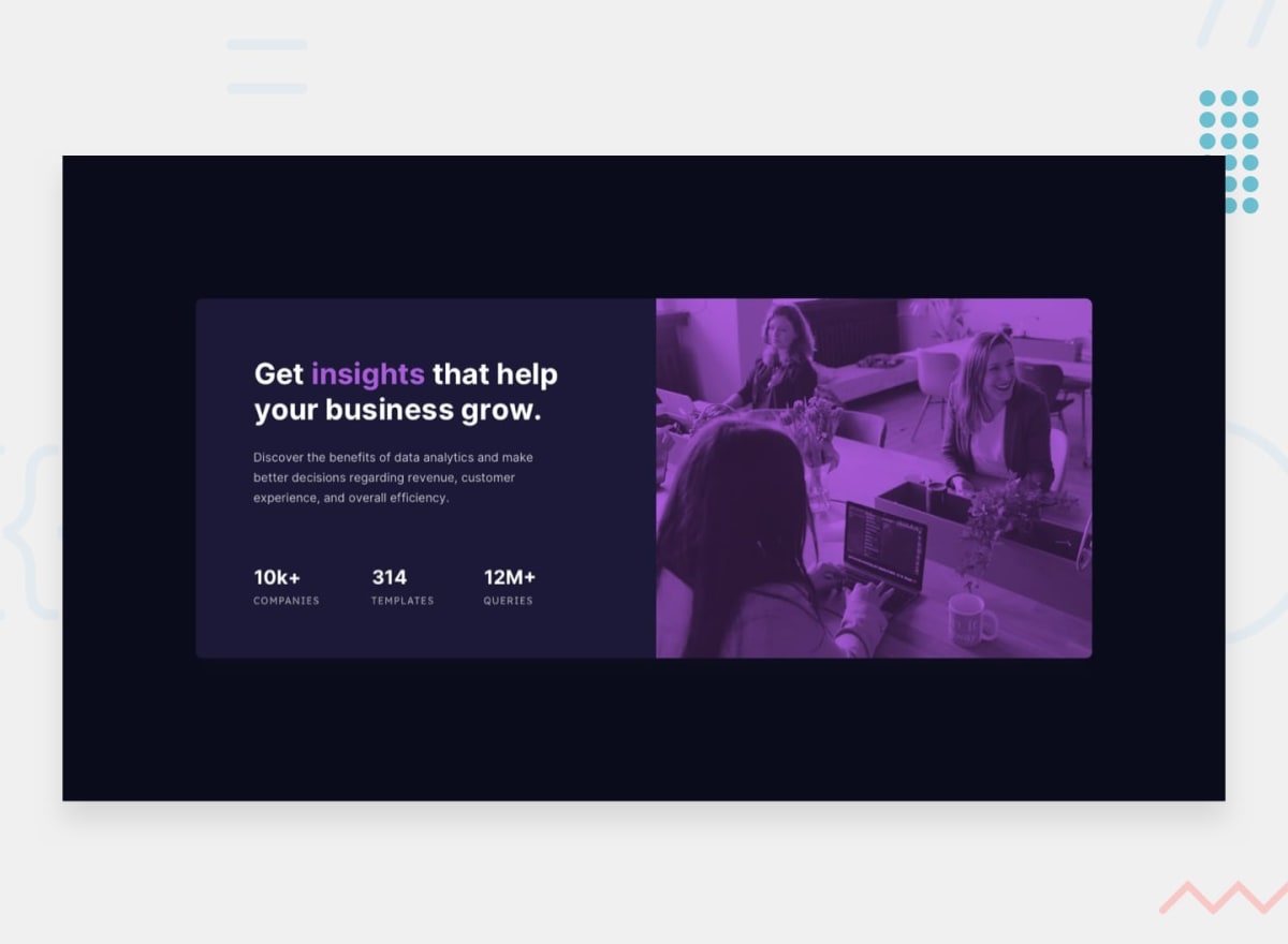
_25<!DOCTYPE html>_25<html>_25 <head>_25 <title>Parcel Sandbox</title>_25 <meta charset="UTF-8" />_25 </head>_25 <body>_25 <section>_25 <div class="card-content">_25 <h2>_25 Get <span class="insight">insights</span> that help your business_25 grow._25 </h2>_25 <p class="card-info">_25 Discover the benefits of data analytics and make better decisions_25 regarding revenue, customer experience, and overall efficiency._25 </p>_25_25 <div class="card-social-media"></div>_25 </div>_25 <div class="office-image"></div>_25 </section>_25 <script src="src/index.js"></script>_25 </body>_25</html>
Card Info
Reduce the size of para a tat
index.html
src/styles.css
_34@import url("https://fonts.googleapis.com/css2?family=Lexend+Deca&display=swap");_34_34:root {_34 font-size: 15px;_34}_34_34section {_34 display: flex;_34 background: hsl(244, 38%, 16%);_34 color: hsl(0, 0%, 100%);_34 border-radius: 2rem;_34 overflow: hidden;_34 flex-direction: column-reverse;_34 text-align: center;_34}_34_34.card-content {_34 padding: 2rem;_34}_34_34.office-image {_34 background: url(https://www.incimages.com/uploaded_files/image/1920x1080/getty_533979847_128300.jpg),_34 hsl(277, 64%, 61%);_34 min-height: 20rem;_34 width: 100%;_34 background-size: cover;_34 background-blend-mode: luminosity;_34 background-overflow: hidden;_34 /* width: 100px; */_34}_34_34.card-info {_34 font-size: 0.8rem;_34}
Card social media
Stats of the companies
index.html
src/styles.css
_38<!DOCTYPE html>_38<html>_38 <head>_38 <title>Parcel Sandbox</title>_38 <meta charset="UTF-8" />_38 </head>_38 <body>_38 <section>_38 <div class="card-content">_38 <h2>_38 Get <span class="insight">insights</span> that help your business_38 grow._38 </h2>_38 <p class="card-info">_38 Discover the benefits of data analytics and make better decisions_38 regarding revenue, customer experience, and overall efficiency._38 </p>_38_38 <div class="card-social-media">_38 <div>_38 <p>10k+</p>_38 <p>companies</p>_38 </div>_38 <div>_38 <p>314</p>_38 <p>templates</p>_38 </div>_38 <div>_38 <p>12m+</p>_38 <p>queries</p>_38 </div>_38 </div>_38 </div>_38 <div class="office-image"></div>_38 </section>_38 <script src="src/index.js"></script>_38 </body>_38</html>
Center the stats
Align the data in the center
index.html
src/styles.css
_41@import url("https://fonts.googleapis.com/css2?family=Lexend+Deca&display=swap");_41_41:root {_41 font-size: 15px;_41}_41_41section {_41 display: flex;_41 background: hsl(244, 38%, 16%);_41 color: hsl(0, 0%, 100%);_41 border-radius: 2rem;_41 overflow: hidden;_41 flex-direction: column-reverse;_41 text-align: center;_41}_41_41.card-content {_41 padding: 2rem;_41}_41_41.office-image {_41 background: url(https://www.incimages.com/uploaded_files/image/1920x1080/getty_533979847_128300.jpg),_41 hsl(277, 64%, 61%);_41 min-height: 20rem;_41 width: 100%;_41 background-size: cover;_41 background-blend-mode: luminosity;_41 background-overflow: hidden;_41 /* width: 100px; */_41}_41_41.card-info {_41 font-size: 0.8rem;_41}_41_41.card-social-media {_41 display: flex;_41 flex-direction: column;_41 justify-content: space-between;_41 align-items: center;_41}
Count styling helper
Adding class to count to style easier
index.html
src/styles.css
_38<!DOCTYPE html>_38<html>_38 <head>_38 <title>Parcel Sandbox</title>_38 <meta charset="UTF-8" />_38 </head>_38 <body>_38 <section>_38 <div class="card-content">_38 <h2>_38 Get <span class="insight">insights</span> that help your business_38 grow._38 </h2>_38 <p class="card-info">_38 Discover the benefits of data analytics and make better decisions_38 regarding revenue, customer experience, and overall efficiency._38 </p>_38_38 <div class="card-social-media">_38 <div>_38 <p class="card-count">10k+</p>_38 <p>companies</p>_38 </div>_38 <div>_38 <p class="card-count">314</p>_38 <p>templates</p>_38 </div>_38 <div>_38 <p class="card-count">12m+</p>_38 <p>queries</p>_38 </div>_38 </div>_38 </div>_38 <div class="office-image"></div>_38 </section>_38 <script src="src/index.js"></script>_38 </body>_38</html>
Count styling
- Fancy 🎉 text gradient on the count
- Uppercase on the next para to count & sliming it
index.html
src/styles.css
_59@import url("https://fonts.googleapis.com/css2?family=Lexend+Deca&display=swap");_59_59:root {_59 font-size: 15px;_59}_59_59section {_59 display: flex;_59 background: hsl(244, 38%, 16%);_59 color: hsl(0, 0%, 100%);_59 border-radius: 2rem;_59 overflow: hidden;_59 flex-direction: column-reverse;_59 text-align: center;_59}_59_59.card-content {_59 padding: 2rem;_59}_59_59.office-image {_59 background: url(https://www.incimages.com/uploaded_files/image/1920x1080/getty_533979847_128300.jpg),_59 hsl(277, 64%, 61%);_59 min-height: 20rem;_59 width: 100%;_59 background-size: cover;_59 background-blend-mode: luminosity;_59 background-overflow: hidden;_59 /* width: 100px; */_59}_59_59.card-info {_59 font-size: 0.8rem;_59}_59_59.card-social-media {_59 display: flex;_59 flex-direction: column;_59 justify-content: space-between;_59 align-items: center;_59}_59_59.card-count {_59 font-size: 1.3rem;_59 font-weight: bold;_59 margin-bottom: 5px;_59_59 background: linear-gradient(to left, hsl(277, 64%, 61%) 10%, #30cfd0);_59_59 -webkit-background-clip: text;_59 -webkit-text-fill-color: transparent;_59}_59_59.card-count + p {_59 text-transform: uppercase;_59 font-size: 0.8rem;_59 font-weight: 100;_59 margin: 0px;_59}
Responsiveness
- Side by side on a bigger screen
- Align left
index.html
src/styles.css
_78@import url("https://fonts.googleapis.com/css2?family=Lexend+Deca&display=swap");_78_78:root {_78 font-size: 15px;_78}_78_78section {_78 display: flex;_78 background: hsl(244, 38%, 16%);_78 color: hsl(0, 0%, 100%);_78 border-radius: 2rem;_78 overflow: hidden;_78 flex-direction: column-reverse;_78 text-align: center;_78}_78_78.card-content {_78 padding: 2rem;_78}_78_78.office-image {_78 background: url(https://www.incimages.com/uploaded_files/image/1920x1080/getty_533979847_128300.jpg),_78 hsl(277, 64%, 61%);_78 min-height: 20rem;_78 width: 100%;_78 background-size: cover;_78 background-blend-mode: luminosity;_78 background-overflow: hidden;_78 /* width: 100px; */_78}_78_78.card-info {_78 font-size: 0.8rem;_78}_78_78.card-social-media {_78 display: flex;_78 flex-direction: column;_78 justify-content: space-between;_78 align-items: center;_78}_78_78.card-count {_78 font-size: 1.3rem;_78 font-weight: bold;_78 margin-bottom: 5px;_78_78 background: linear-gradient(to left, hsl(277, 64%, 61%) 10%, #30cfd0);_78_78 -webkit-background-clip: text;_78 -webkit-text-fill-color: transparent;_78}_78_78.card-count + p {_78 text-transform: uppercase;_78 font-size: 0.8rem;_78 font-weight: 100;_78 margin: 0px;_78}_78_78/* Responsive layout */_78/* 475px - breakpoint */_78@media (min-width: 600px) {_78 section {_78 flex-direction: row;_78 text-align: left;_78 }_78_78 .office-image {_78 background: url(https://www.incimages.com/uploaded_files/image/1920x1080/getty_533979847_128300.jpg),_78 orchid;_78 background-size: cover;_78 }_78_78 .card-social-media {_78 flex-direction: row;_78 }_78}
Glitter ✨
Backgroundwith a beautiful gradient- Nicer
font-stylelifts the entire app to the next level - Center the whole thing on the page
index.html
src/styles.css
_95@import url("https://fonts.googleapis.com/css2?family=Lexend+Deca&display=swap");_95_95:root {_95 font-size: 15px;_95}_95_95section {_95 display: flex;_95 background: hsl(244, 38%, 16%);_95 color: hsl(0, 0%, 100%);_95 border-radius: 2rem;_95 overflow: hidden;_95 flex-direction: column-reverse;_95 text-align: center;_95}_95_95.card-content {_95 padding: 2rem;_95}_95_95.office-image {_95 background: url(https://www.incimages.com/uploaded_files/image/1920x1080/getty_533979847_128300.jpg),_95 hsl(277, 64%, 61%);_95 min-height: 20rem;_95 width: 100%;_95 background-size: cover;_95 background-blend-mode: luminosity;_95 background-overflow: hidden;_95 /* width: 100px; */_95}_95_95.card-info {_95 font-size: 0.8rem;_95}_95_95.card-social-media {_95 display: flex;_95 flex-direction: column;_95 justify-content: space-between;_95 align-items: center;_95}_95_95.card-count {_95 font-size: 1.3rem;_95 font-weight: bold;_95 margin-bottom: 5px;_95_95 background: linear-gradient(to left, hsl(277, 64%, 61%) 10%, #30cfd0);_95_95 -webkit-background-clip: text;_95 -webkit-text-fill-color: transparent;_95}_95_95.card-count + p {_95 text-transform: uppercase;_95 font-size: 0.8rem;_95 font-weight: 100;_95 margin: 0px;_95}_95_95/* Responsive layout */_95/* 475px - breakpoint */_95@media (min-width: 600px) {_95 section {_95 flex-direction: row;_95 text-align: left;_95 }_95_95 .office-image {_95 background: url(https://www.incimages.com/uploaded_files/image/1920x1080/getty_533979847_128300.jpg),_95 orchid;_95 background-size: cover;_95 }_95_95 .card-social-media {_95 flex-direction: row;_95 }_95}_95_95body {_95 font-family: "Lexend Deca", sans-serif;_95 /* background: hsl(233, 47%, 7%); */_95 background-image: linear-gradient(_95 to right top,_95 #051937,_95 #33275d,_95 #6f2d78,_95 #b12681,_95 #f01a78_95 );_95 display: flex;_95 height: 100vh;_95 align-items: center;_95 justify-content: center;_95}
Setup
Let's start with an empty section
Adding two container
- Card content
- Office image
Adding image cover
- Adding office cover as a background to mix with a nice color ✨
blend-modeis like Insta filter- Choose the best filter to match with color you chose
Card Content
- Heading content
- Para content
Card Info
Reduce the size of para a tat
Card social media
Stats of the companies
Center the stats
Align the data in the center
Count styling helper
Adding class to count to style easier
Count styling
- Fancy 🎉 text gradient on the count
- Uppercase on the next para to count & sliming it
Responsiveness
- Side by side on a bigger screen
- Align left
Glitter ✨
Backgroundwith a beautiful gradient- Nicer
font-stylelifts the entire app to the next level - Center the whole thing on the page
@ragavkumarv
swipe to next ➡️